Satiladu: design module
Satiladu is an interactive satellite data viewing application and tool that offers the possibility to explore satellite images dynamically. Users can assess how this data could enrich their field or interests. They can also use the app to create personalised map layers and share them with others.
On the search page, you can find the satellite image you want to study by setting the date range. Clicking on the image will open a preview window (Figure 1). In the preview window, you can change the date using the side arrows or change the filter using the arrows at the top of the window. You can access the design module by clicking on the "Design mode" or "See closeup" buttons, which will open the Satiladu's internal application.
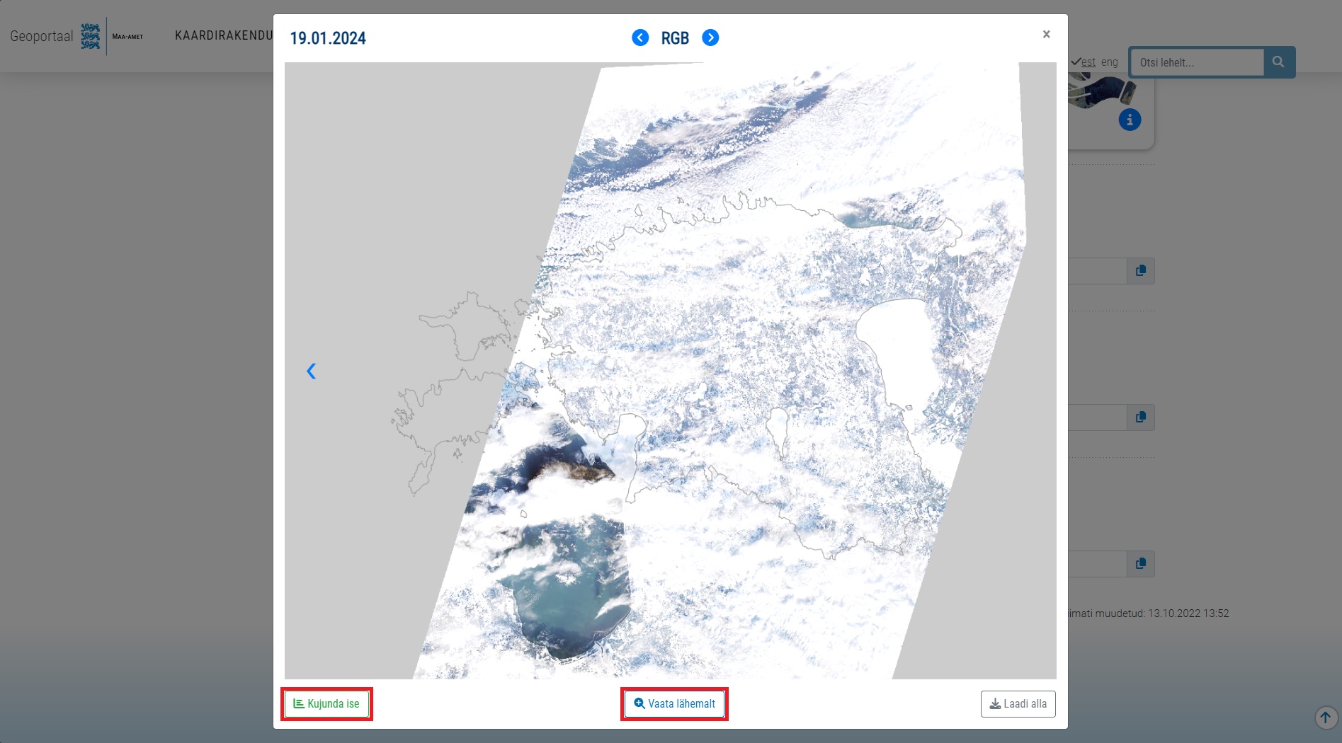
Image 1. Satiladu's search page preview window, through which it is possible to access the internal application in more detail.
If you clicked on the "Design mode" button, you will have the design module with sliders already open in the page that opens. If you click on the "See more" button, you can open the design module itself by clicking on the button shown in the top right corner of the screen (Figure 2). For a more convenient way to navigate the map, you can use the hybrid map (bottom left corner) or the in-ADS address lookup field (white text in the top left corner, or top right corner if you are in mobile view). When using the imagery module, we recommend turning off the hybrid map, as the phenomena and items on it can obscure the content of the satellite image, especially if you want to take a closer look at bodies of water.
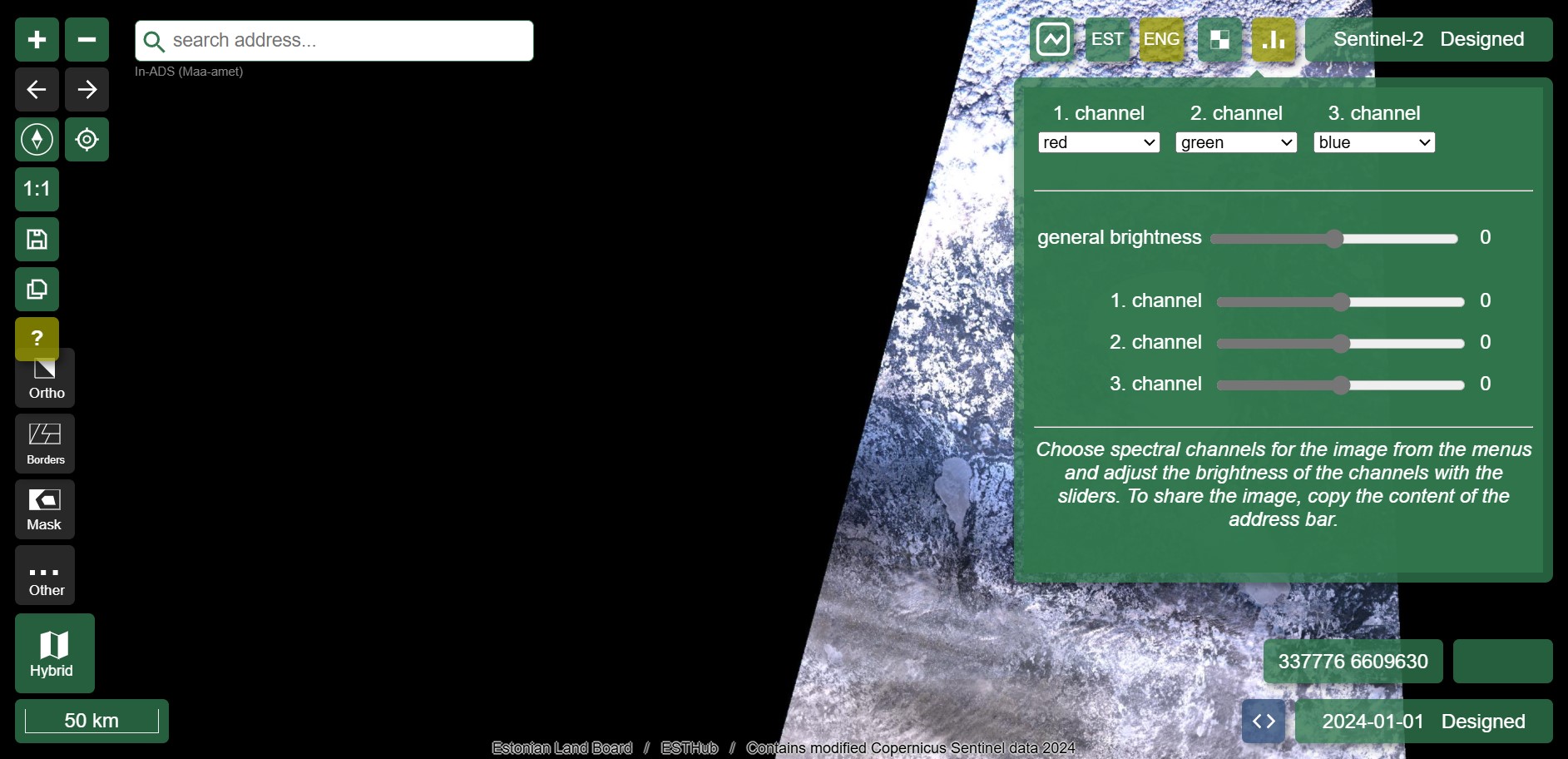
Image 2. Satiladu's view of the internal application, with the design module open in the top right corner.
Light and colours
Light can be measured and quantified as wavelengths in the electromagnetic spectrum. Colour is the visible light perceived by the human eye. The ability of humans to see and perceive colours in a similar way is based on physiology, in particular the structure of the retina and the optic nerve, on the one hand, and on experience and cultural influences on the other. However, the colour perception that people experience for a particular wavelength of light is subjective. Each person's perception of colour may vary slightly, depending on their visual system, the sensitivity of their eyes to different wavelengths, the reflective and diffusive properties of light in the environment and many other aspects.
Colours in satellite images may vary depending on lighting and atmospheric conditions. For example, the representation of the same object, such as vegetation or bodies of water, may appear different depending on the time the image was captured, the presence of clouds or atmospheric pollution that affect the brightness or darkness of the objects displayed. Also, contrast or the colour of neighbouring objects may affect the distinction of details in the image.
Satiladu's range of differently coloured map products allows you to choose the colour scheme that suits you best or is easier to understand, offering a diverse user experience and taking into account people's different perceptions and preferences. Where appropriate, the colour scheme should be tailored to the specific objectives and requirements of the application, in order to highlight important objects or phenomena. For example, in the case of agricultural landscapes, colours will be chosen to clearly highlight different stages of agricultural activity or land use, where it is important to clearly distinguish between water and land when highlighting flooding. The Satiladu's design module allows for easy customisation of colours.
RGB
RGB combination is the way in which displays, smart devices and other screens create different colours. The abbreviation stands for three primary colours: red (R), green (G) and blue (B). The RGB colour model allows the colour of each pixel to be represented using three primary colour components, the values of which determine how much red, green and blue each pixel contains. If we look at the RGB satellite image (Figure 3), we get a result close to nature, as it mimics the colours perceived by the human eye: water bodies are blue, forests and grasslands are green, and artificial surfaces without vegetation are greyish or tan. RGB satellite imagery is a good reference image to use when looking at a false-colour image in a modified spectral combination, as it shows phenomena in a more intuitive colour that we recognise.
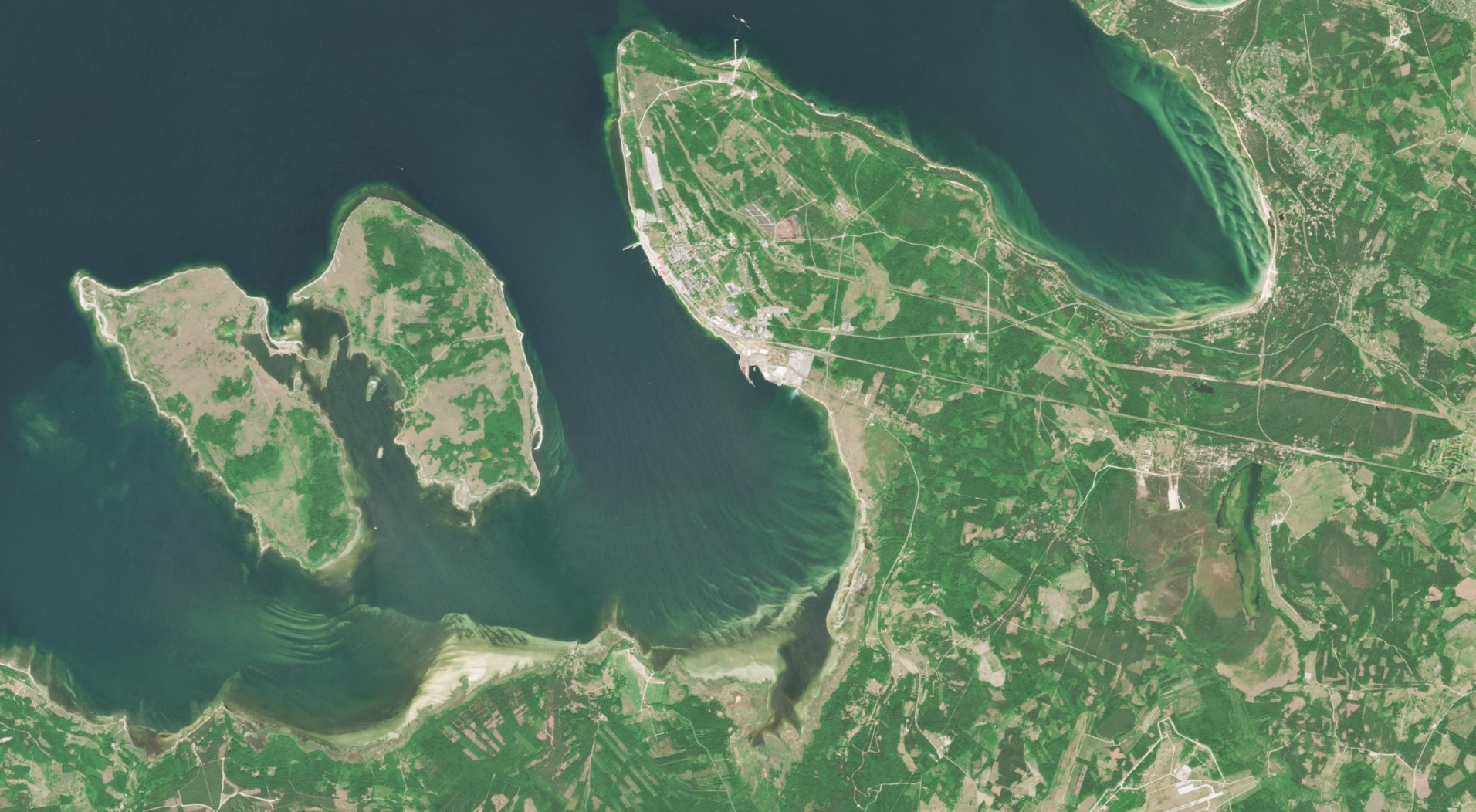
Image 3. Image in RGB colors, featuring the Pakri Islands and the Paldiski Peninsula (2023-06-08 viide Satilattu).
Thus, remote sensing sensors collect reflected light from the ground and present it in digital form. The pixels are squares of a specific colour and brightness, which together form an image. Each pixel carries information about the reflectance of the light in the corresponding area. In an RGB photographic image, the intensity of each colour is expressed as a numerical value, usually between 0 and 255. Each value corresponds to how strongly each colour (red, green, blue) is represented in a given pixel. For example, a numerical triple of 62, 181, 157 means that the red component has a brightness of 62, the green component has a brightness of 181 and the blue component has a brightness of 157. To the human eye, such a pixel would appear to have a beautiful greenish-blue hue. The RGB colour system can also be explored, for example, in image editing programs (e.g. MS Paint in Figure 4).
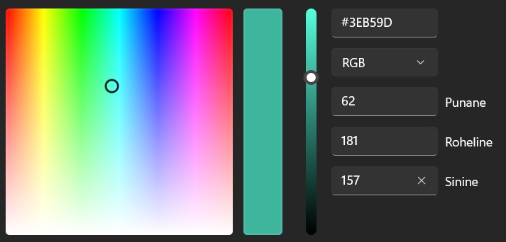 Image 4. Example of the RGB color system in the image editing program MS Paint.
By default, the light spectrum sequence in the design module is also RGB - the parameters from left to right are channel 1 red, channel 2 green, channel 3 blue (Figure 5). At the bottom of the module, the user can change the brightness level of these channels using the slider. In essence, the design module allows us to choose which channel of the visible spectrum - red, green or blue - to place the information measured by the sensor. There are six different parameters to choose from: red, green, blue, near infrared, NDVI, NDPI. The last two are computationally derived indices which you can read more about on the NDVI or NDPI page respectively.
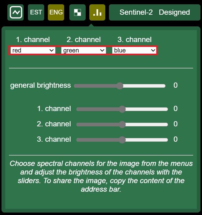
Image 5. Satiladu design module default setting: spectral sequence 'red - green - blue' and slider positions at zero..
According to the general satellite image coloring logic in the framing module, high (positive) values measured by the sensor in channel 1 (red) will come out in red, and in channel 2 (green) and channel 3 (blue) in green and blue, respectively. Note, however, that depending on the position of the sliders, the colours also interact with each other. This is well illustrated by the RGB-CMY colour model (Figure 6). With a certain reservation, we can make the generalisation that if a phenomenon in a satellite image has the same hue as the apex of a triangle, this gives us the information that the values of the parameter placed in the corresponding channel are high at that location. The colours - yellow, violet pink and light blue - in the area between the vertices of the colour triangle (Figure 6) tell us, respectively, that the channel on either side of the colour has more or less equal proportions of spectral values in the area observed in the satellite image. For example, if an area in the satellite image has a bright pink or violet tint, we can conclude that the spectral values in channels 1 and 3 are consequently in comparable proportions, and that the spectral contribution of channel 2 (green) is low. If the satellite image shows an area with a white tint, this indicates that all channels have equal or very similar values, since the white colour is a mixture of the maximum values of all RGB channels.
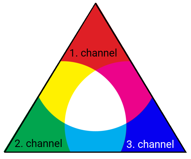
Image 6. RGB-CMY color model, which helps to understand the colorization logic of the satellite image in the design module.
In the following illustration (Figure 7), the red-green-blue (RGB) spectral combination is used for each example, i.e. channel 1 is red, channel 2 green and channel 3 blue. For the purpose of demonstration, it is shown how the satellite image is coloured when the values of one channel are over-amplified using the slider and the values of the other channels are minimised accordingly: looking from left to right, the red light in channel 1 (left), the green light in channel 2 (centre) and the blue visible light spectrum in channel 3 (right) are maximised alternately.
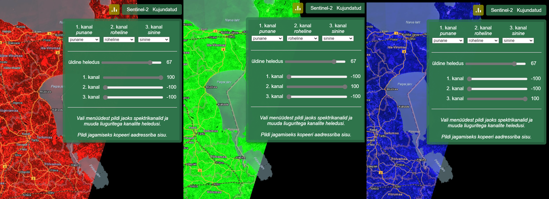
Image 7. In the design module, the sensor-measured values can be minimized or maximized by adjusting the sliders, depending on what needs to be better emphasized in the satellite image. Here the amplification of the red, green, and blue light intensities is demonstrated.
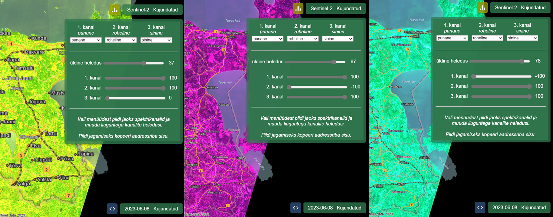
Image 8. Colors interact when combining different channels with each other.
Design module and LUT component
A bit (binary digit) is the smallest unit of data in computing, with two possible values - 0 or 1. It is the basis of computer systems in which data is processed and stored in binary. The so-called 8-bit uses 8 bits to represent a value, allowing a total of 2^8, or 256 possible values between 0 and 255. In the case of images, for example, it is often used for grayscale, where each pixel can be one of 256 different tones.
LUT is derived from the English equivalent of Look-up table. It could be translated as 'look-up table', which in data science is commonly used to find data according to the key value entered. The tones 0 to 255 are divided into eight values: 0, 31, 63, 95, 127, 159, 191, 223, 255. We can imagine these shades as a gradient from black (0) to white (255).
If the position of the sliders in the design module is initially unchanged, this will be reflected in the LUT values. The address bar shows lut1=0:0,31:31,63:63,95:95,127:127,159:159,191:191,223:223, 255:255 - all the value pairs are the same (Figure 9).

Image 9. LUT parameters (highlighted in yellow) can be found in the address bar of the internal application when using the design module.
If you now move the sliders, the LUT values are recalculated, for example:
lut1=0:0,31:97,63:166,95:210,127:235,159:159,191:191,233:233,255:255.
A new value is calculated for the tones according to the changes made in the slider, with the start and end (i.e. 0 and 255) remaining unchanged. For example, in this example, the value 31 is replaced by 97 (the corresponding part of the channel becomes lighter). The values are changed linearly. These values are in the range 0-255, although the original image itself is 16-bit, i.e. values in the range 0-65535. Thus, the LUT can be used to 'squeeze' the values into an 8-bit range (0 to 255). Since the original 16-bit image ranges from 0 to 65535, the scale is first narrowed to 0 to 4080 to make the image range more suitable for further processing on an 8-bit scale (0 to 255).
Thus the values of the corresponding part of this channel are changed, for example:
0 - 65535 -> 0 - 4080 -> 0 - 255, where 0 - 31 becomes 0 - 97 and 31 - 97 becomes 63 - 166, and then the remaining values are scaled accordingly to achieve the desired visual contrast and brightness.
All channels are treated equally. This means that whatever their original value is, that's how they are displayed. The conversion of the original values of the channels is done by assembling the tails (picture boxes). Different channels may be scaled differently according to their values to enhance visibility. In the output file, all channels are Unsigned 16bit, i.e. without negative values and in the range 0-65535. If a channel has lower values in the input file (i.e. it is already darker), it will unfortunately also appear darker in the output and more brightness will need to be added.
The summer RGB satellite image is usually dominantly green, which generally means high values for green light and near-infrared. A winter RGB satellite image is typically in brown tones, or bluish white when snow cover is on the ground - with significantly lower values for green and near-infrared light and higher values for red light. In the example (Figure 10), the right-hand visual could logically be light blue, but the image is still largely in green tones because the green light spectrum is so dominant in summer.
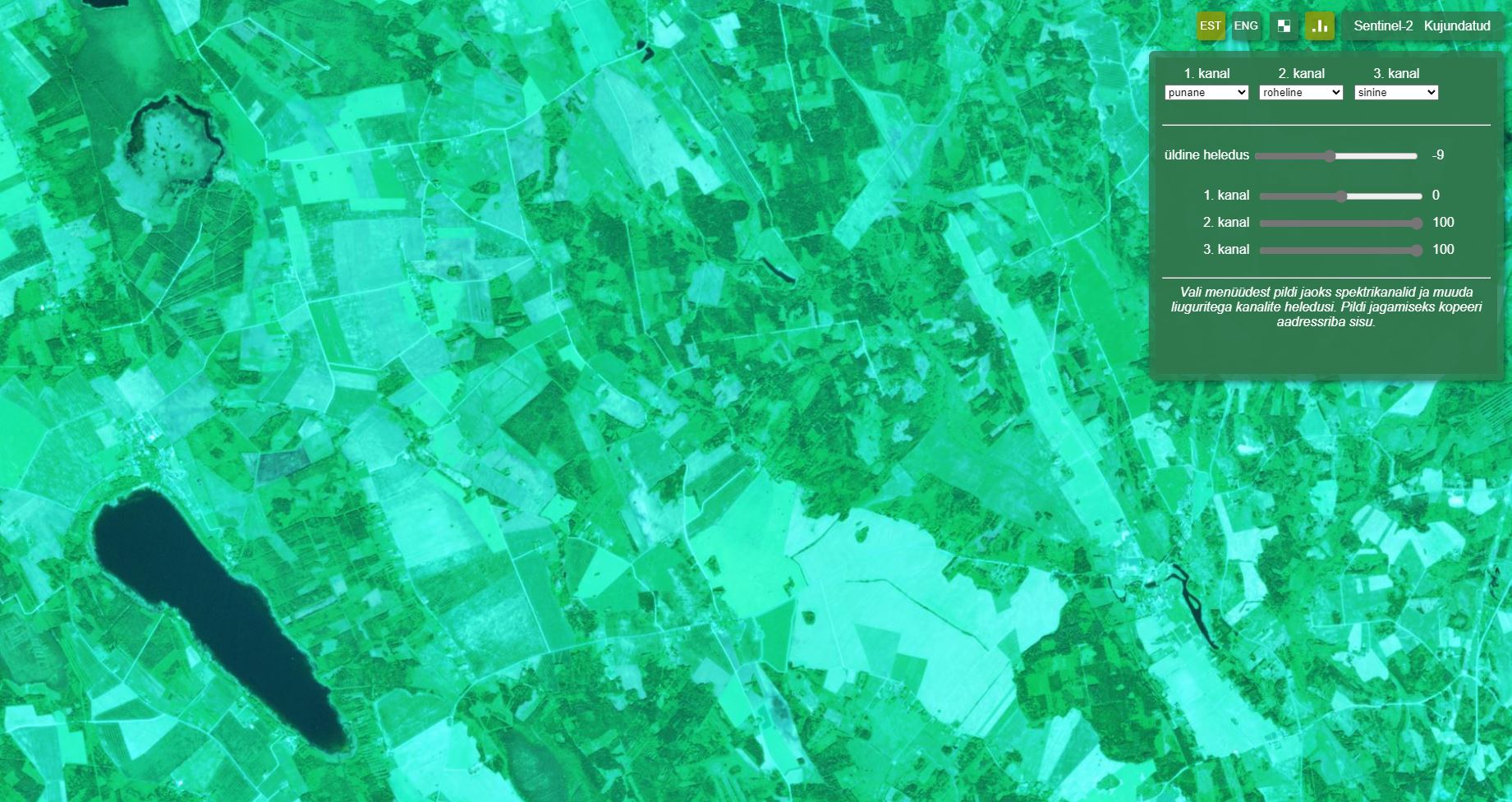
Image 10. Summer RGB satellite image, with the proportion of green and blue light enhanced using the design module.
One useful method to apply is to set all the spectral channels to the same parameter, for example red light (Figure 11). Aligning the channels (e.g. by choosing a combination of Red-Red-Red) makes the image black and white, as all channels transmit the same intensity level. This helps to analyse how one component of the spectrum affects the image, without the interfering effect of other spectra. In the black and white image that is formed, the black tone indicates that the spectral intensity of the parameter selected in the channels (e.g. red) is low or completely absent. Conversely, a white tone indicates that the intensity of the corresponding spectrum is at its highest. Meanwhile, the grey tones represent the average values of the spectral intensities: darker grey tones indicate lower intensities, lighter grey tones higher intensities.
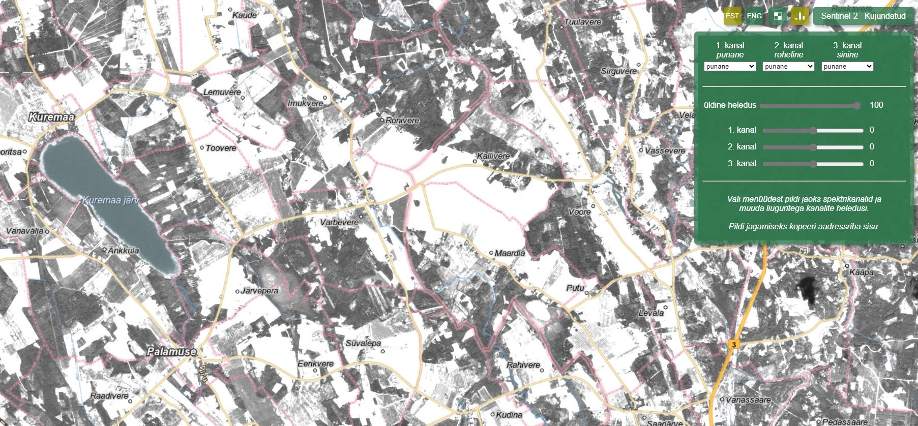
Image 11. Here the intensity of red light placed into each visible spectrum channel. As a result, the satellite image appears black and white.
Parameters in the address bar and their applicability
The following is an example of the address bar parameters for the Satilao internal application with explanations.
https://teenus.maaamet.ee/ows/wms-satiladu?sensor=sentinel-2&
filter=msi&bands=1,2,3&
curve=-1&curver=1&curveg=1&curveb=1&
lut1=0:0,31:31,63:63,95:95,127:127,159:159,191:191,223:223,255:255&
lut2=0:0,31:31,63:63,95:95,127:127,159:159,191:191,223:223,255:255&
lut3=0:0,31:31,63:63,95:95,127:127,159:159,191:191,223:223,255:255&
date=2023-06-08&csensor=sentinel-2&
cfilter=msi&cbands=1,2,3&
ccurve=100&ccurver=66&ccurveg=100&ccurveb=100&
clut1=0:0,31:255,63:255,95:255,127:255,159:255,191:255,223:255,255:255&
clut2=0:0,31:255,63:255,95:255,127:255,159:255,191:255,223:255,255:255&,
clut3=0:0,31:255,63:255,95:255,127:255,159:255,191:255,223:255,255:255&
cdate=2023-06-10&mapbox=484674,6568590,526417,6587877
Explanation of the parameters provided in the URL:
- sensor=sentinel-2
Specifies that data from the Sentinel-2 satellite mission is used. - filter=msi
Specifies that MSI (Multispectral Instrument) filter sensors are used. - bands=1,2,3
Specifies that three different spectrum channels are used: band 1 (red), band 2 (green), band 3 (blue). These channels are the standard RGB channel equivalents used for color conversion and analysis of satellite images. - curve=-1, curver=1, curveg=1, curveb=1
Defines the values of the color curves used to adjust the tones of the images.- curve=-1: A general curve, which can mean changing the contrast or brightness of the entire image.
- curver=1, curveg=1, curveb=1: Separately set curves for the red (r), green (g) and blue (b) channels to adjust the color of each channel.
- lut1, lut2, lut3
Determine the LUT (Look-Up Table) values for each channel:- lut1: for red channel (for example 0:0, 31:31, etc.)
- lut2: green channel
- lut3: blue channel
The LUT values determine how each spectrum value (0-255) is mapped to hues.
- date=2023-06-08
Specifies that the observed satellite image is from the date 2023-06-08. - csensor=sentinel-2
Specifies that the sensor for the compared image is Sentinel-2. - cfilter=msi
Similar to specifying filter=msi, which specifies that the compared sensor is also an MSI. - cbands=1,2,3
Specifies that spectral channels 1, 2, 3 are compared, which as previously mentioned are red, green and blue. - ccurve=100, ccurver=66, ccurveg=100, ccurveb=100
Specify the strength or values of the compared color curves that determine the contrast and tonal effects of each channel. These values can be related to image brightening or contrast adjustment. - clut1, clut2, clut3
Similar to specifying lut1, lut2, lut3, but clut1, clut2, clut3 specify the color values of the compared satellite image from which the image is generated and displayed. - cdate=2023-06-10
Specifies that the comparable date is 2023-06-10. - mapbox=484674,6568590,526417,6587877
This sets the coordinates of the map viewport, which determines which area to display on the map. Coordinates refer to the right, left, top and bottom corners of the map.